MAKING BAD LOGOS BETTER
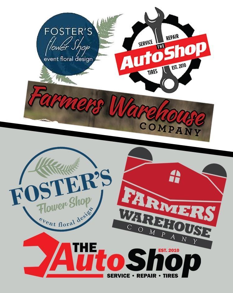
As I was flipping through the world wide web looking for inspiration. I couldn’t help but notice logos of businesses that really needed some improvement. So I challenged myself to find 3 bad logos, and make them better.

So I dug deep into the web to find logos that were in need of improvement to see what I could do. I started by picking a random business like auto repair. Then I googled that term and skipped through about 20 pages of results. The first business I saw with a not so pretty logo, I saved it.
Table of Contents
THE AUTOSHOP

The first business I searched for was auto repair. I came across the logo for The Auto Shop. Upon first glance, the main typeface was not horrible but I noticed the logo was a bit busy. It had a lot going on. It was clear that this logo would not work well if it had to be in one color. It looked very generic and needed some love.

My primary objective with this logo was to simplify it, which in turn would make it more memorable. I used a similar typeface and kept all of the information, but laid it out in a more pleasing format. This change is subtle enough that any previous customer would likely still recognize the business, but improved enough to be more effective as a logo.
FOSTER’S FLOWER SHOP

My next search term was flower shop, which brought me to Foster’s Flower Shop on the 18th page of Google. This logo, I’m afraid, is a mess. The first thing I noticed is that it was hard to read. Also, a good logo should not lose detail when rendered in a single color, and this one would lose a lot. It was also pretty busy for my taste.

I wasn’t crazy about the fonts in the original logo. They just seemed too plain, and the scrip font was all over the place. So my first objective was to find a good font that had some character for the name, and a script font that wasn’t quite so wild. I created a more simplistic fern leaf and used a circular outline to keep it all in order with the tagline curved along the bottom of it. I feel this logo is a much better logo that’s not nearly as busy and it would work great as a single color if needed.
FARMERS WAREHOUSE COMPANY

Where do I begin with this logo. I’m not even sure I can call it a logo. It needs a lot of love. Lets be honest, it needs a lot more than that. With the other logos I was able to maintain the colors and the improved logo still slightly resembled the original, but in this case, I will not be able to do that. The font just doesn’t say farmer to me. Nothing about this logo is salvageable except maybe the color. Maybe.

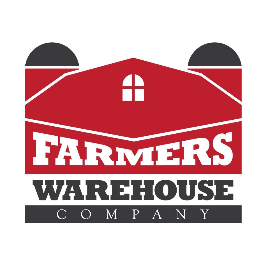
I really wanted this logo to shout farm warehouse. So I used a farm warehouse as the logo. The font is cleaner, you definitely get an idea about this company when you see this logo. The logo is simple, versatile, easily recognizable and memorable. This logo would make a positive impact on the business and would do well as a representation of the brand.
SUMMARY
So there ya have it. Three bad logos made better. While art in general can be subjective, when it comes to a business logo you have to meet certain criteria.
The logo should be memorable, it shouldn’t be too busy and complex as that takes away from its memorability. A logo needs to work in one color as there will be times where you will not be able to use a full color logo. It needs to be clear and legible, this is related to memorability but also as a means of identification. A logo needs to be legible when the size is reduced. You should be able to shrink your logo down to a 1 inch width and still be able to recognize the geometry and words. So when I say a logo is bad, I am not saying it isn’t art, I am simply saying it lacks the important aspects that make up a great logo.
ABOUT THE AUTHOR
My name is Dennis Bosher. I have been in the design business for nearly 15 years, with a large portion of that focused on branding and identity development. Branding has been a passion of mine for a very long time.
If you would like to reach out, feel free to contact me and I will be happy to get back to you.


0 thoughts on “MAKING BAD LOGOS BETTER”