BRANDING STRATEGY EXAMPLE
Table of Contents
Assignment
This is for a client who had supposedly fully developed a business plan in order to launch a restaurant in Menorca, one of the Spanish Balearic Islands. He had not come up with a branding strategy.

His objective was to attract both locals and tourists with an interest for the Mediterranean diet. He also needed to create an innovative touch in the branding of the restaurant.
After talking with us, he realized the importance of building a powerful brand and asks for our help.
The objective was to create a fully developed brand strategy and identity for the restaurant in Menorca.
Segmentation
The first objective was to identify the target. With a brand segmentation using an iceberg model.

From the iceberg model we learn some important insight about the consumer. This gives us an edge when developing the brand and positioning it.
Brand Position
Next we identify the brand positioning and plot it on a perceptual map. This required defining several elements of the brand and market, including competitors.

Using the iceberg model we were able to deduce that the consumer is likely healthy conscious and while most Mediterranean restaurants offer healthy food, there was less focus on the atmosphere. That is where Cala Tortuga would have an edge. We show this in the perceptual mapping.
Brand House
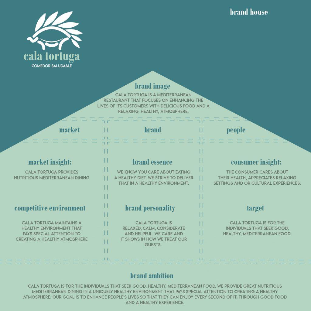
Next we build the brand house. This is a set of defining points that make up the brand, the consumer and the market.

Brand Manifesto
Next we come up with the brand manifesto. This is a short statement that is meant to connect with the consumer. It expresses the values that the brand shares with the consumer.

Brand Colors
While you have already seen parts of the identity, all of the above items were defined prior to any parts of the identity.

Colors were chosen that represented calm and relaxation, as well as a connection to the Mediterranean.
Brand Logo
Once colors were selected we focused on one of the most important parts of the brand. The name and the logo.

We came up with the name which stands for Tortoise Cove. We went with tortoise due to the long lifespan associated with tortoises. We believed it was a good representation of a health conscious lifestyle. Turtles are also know to be all over the islands.
The leaves along the top of the tortoise shell are meant to represent the olive branch which grows wild all over the islands.
Typography
Next we address the typography used. We are careful to use a typeface that is calming and pleasent.

For the Bodoni MT typeface, we choose to standardize lowercase usage. We do this to keep the text consistent and less aggressive.
The secondary typeface is lemonmilk which is an all cap typeface. While this may seem contradictory considering the primary typeface is only using lowercase, we feel it brings some balance as it will only be used for smaller type.
Sound Design
This brand is unique in the sense that it intends to design a specific atmosphere for its guest.

This atmosphere is defined above with items like music, kitchen noise, guest interactions. This may seem extreme but it is a part of the brands point of difference. It is what makes them stand apart from the rest. Not only do they provide healthy food but they do so in a healthy atmosphere free of noises and chaos which can be distracting, stressful and ultimately unhealthy.
There is a lot that goes into branding strategy. This is not an actual client but an assignment that I completed through a course from IE Business School on branding strategy. Therefore, I thought it would be appropriate to share this because while some of the info is meant for the public much of it is not. It shows consumer and market insight, this is like a secret recipe that creates an edge in the market. Its the real process that goes on behind the scenes. It is the difference in branding, and creating a logo and some business cards. It is detailed and in-depth with hours upon hours of research involved. If you ever wonder why branding is so expensive think of all the time spent just learning about a brands potential customer. And the hours of thought that goes into the strategy so that a brand will have an edge. This process offers a lot of value to the brand.
If this were an actual client the job would still not be over. The identity is defined and started but there is a lot more to do. Business cards, letterhead, dining room layout and design, website, carry out packaging and more.
A logo may give your business a face, but in order to create an identity, you have to know who you are. If you are ever interested in finding out feel free to contact us for a quote. We would love to get to work on your branding strategy.


Loveloren is a versatile brand offering a range of products including lingerie, swimwear, activewear, accessories, and clothing. Known for its attention to detail, quality materials, and stylish designs, Loveloren caters to individuals seeking fashion-forward and comfortable options for various occasions. Whether it’s intimates for everyday wear, chic swimwear for lounging by the pool, trendy activewear for workouts, or stylish accessories to complete any outfit, Loveloren aims to provide customers with a diverse selection to suit their personal style preferences.