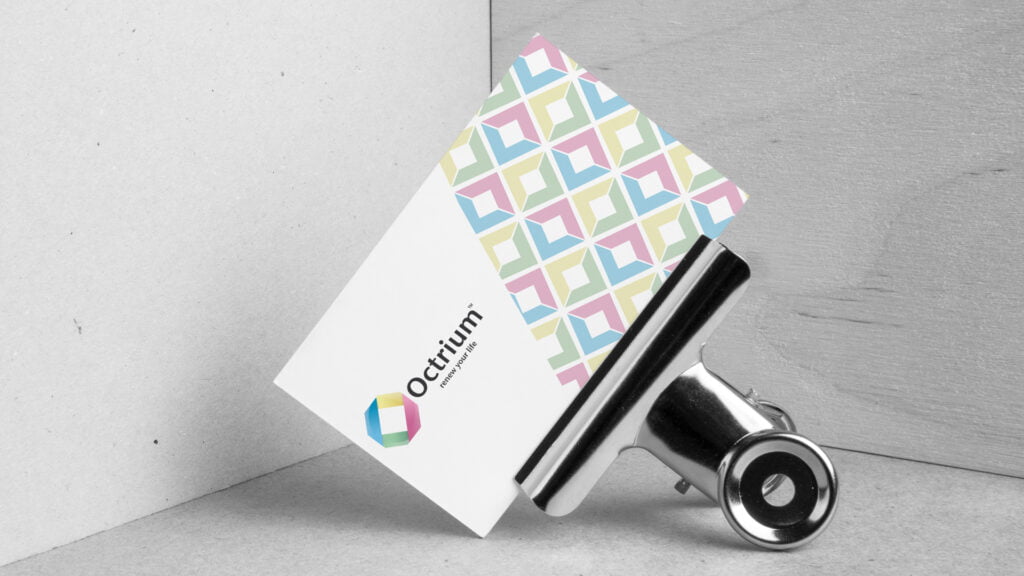
Octrium
Inspiring Wellness and Extending Life Through a Friendly Brand Identity
Client Overview:
Octrium is a startup supplement company dedicated to promoting immune health and offering capsules that claim to extend life. With a strong focus on customer well-being and a friendly approach, Octrium sought a brand identity that would reflect their commitment to improving lives and resonate with a diverse audience.

Objective:
The primary objective of this project was to create a brand identity for Octrium that conveyed a sense of care, approachability, and inclusivity. This involved designing a visually appealing logo, selecting a soft and welcoming color palette, creating a pattern system, and developing various print and digital mockups to showcase the brand’s identity across different touchpoints.
Design Process:
Color Palette:
To reflect Octrium’s commitment to caring for their customers’ well-being, Reevl began by crafting a soft and welcoming color palette. Utilizing a spectrum of colors, the palette aimed to convey accessibility and inclusivity, ensuring that individuals of all genders and ages would feel represented and welcomed by the brand.
Logo Design:
The logo design process focused on capturing Octrium’s friendly and caring nature. Multiple logo options were explored, with an emphasis on incorporating elements that symbolized wellness and vitality. The final logo incorporated a combination of organic shapes and clean typography to create a balanced and visually appealing representation of Octrium’s brand values.
Pattern System:
To enhance the brand identity and create visual consistency, a pattern system was developed based on elements extracted from the logo emblem. This pattern system added depth and visual interest to Octrium’s collateral materials, reinforcing the brand’s personality and creating a recognizable visual motif.
Print Design and Mockups:
To showcase Octrium’s brand identity across various touchpoints, Reevl designed a range of print materials. Mockups were created to present business cards, stationery, and a booklet, demonstrating how Octrium’s visual brand elements seamlessly integrated into tangible collateral, reinforcing the brand’s friendly and professional image.
Pill Bottle Labels:
Recognizing the importance of product packaging, Reevl crafted eye-catching and informative labels for the Octrium supplement bottles. The label design aligned with the brand’s visual identity, combining clarity, readability, and an inviting color scheme that reinforced the brand’s commitment to customer wellness.
Merchandise and Signage:
To expand Octrium’s brand presence, Reevl designed T-shirts featuring the Octrium branding. The T-shirt mockups highlighted how the brand’s visual elements could be effectively translated onto wearable merchandise, promoting brand awareness and creating a sense of community among customers. Additionally, a window sign mockup showcased how Octrium’s logo and brand identity could be displayed prominently, attracting attention and inviting customers into the physical store.


Reevl created a pattern system
based on parts from the logo emblem.

Print design mockups.


Reevl designed labels for
the 60 tablet Octrium bottles.

T-Shirts with the Octrium branding.

Window sign mockup.

Results and Impact:
Friendly and Inclusive Brand Image:
The developed brand identity successfully positioned Octrium as a friendly and caring supplement company. The soft and welcoming color palette, along with the carefully crafted logo, evoked a sense of trust and approachability. This helped Octrium connect with a broad audience seeking immune support and longevity.
Consistent Visual Branding:
The pattern system and cohesive design elements provided Octrium with a consistent visual branding framework. This enhanced brand recognition and reinforced the company’s commitment to quality and professionalism. The visual motifs extended across print materials, product labels, merchandise, and signage, creating a cohesive and memorable brand experience for customers.
Increased Brand Awareness and Engagement:
The thoughtfully designed print materials, including business cards, stationery, booklets, and pill bottle labels, showcased Octrium’s brand identity with impact and professionalism. This contributed to increased brand awareness, customer engagement, and a perception of reliability and credibility. The visually appealing merchandise and window signage further expanded Octrium’s reach

